Google mobile certification Exam

Mobile site design best practices

from a Google certification program for mobile site developers

by Julia Dizhak

moneypark

Google launches new certification program for mobile site developers

techcrunch.com

For whom?

Agenda for exam topics

The study guide covers next topics

  1. module 1 Value proposition of optimized mobile sites
  2. module 2 How to improve mobile site speed
  3. module 3 User design principles for mobile sites
  4. module 4 Advanced web technologies (such as Accelerated Mobile Pages)

Module 1

As users spend more time on mobile devices, getting mobile sites right is crucial to success. If your client’s website is too slow to load, users will drop off. On the other hand, a fast-loading site with bad UX design makes it hard for users to complete their desired action.

Basics of mobile sites

Why do users engage with mobile sites?

  1. Easy to discover: Mobile sites are easily discoverable
  2. Lightweight: Does not require device memory for installation
  3. Intuitive: Users are familiar with how websites work

What are the benefits of Mobile Sites for businesses?

User expectations

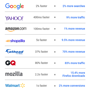
Eliminating extra seconds staring at a blank screen will get consumers to engage more often with your client’s site, which in turn will increase the value per user/visit

Website “obesity”

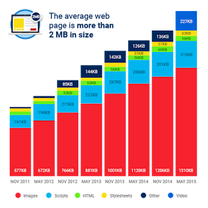
75% of people will abandon a mobile website if it takes any longer than 5 seconds to load.

Why UX matters

UX & conversion rate optimization can open new budget opportunities by improving the profitability of your clients through increasing mobile conversion rates.

Tools to get started

Learn how to use the Chrome DevTools Network panel to understand why a page loads slowly in this step-by-step tutorial.

Targets to focus on

Main Element Target Request Range
JS <20 (not including pixels)
CSS <5
Images <30
Font 0-3
Total 100

The critical rendering path

Optimizing the critical rendering path refers to prioritizing the display of content that relates to the current user action.

To deliver the fastest possible time to first render, we need to minimize three variables:

Optimizing the critical rendering path

Module 3

Learn what makes a good mobile sites

In this module we will learn about UX and design principles for creating a beautiful and functional mobile site for your clients.

UX principles

Mobile users are

  1. typically multitasking or on the go
  2. have a short amount of time to complete a task
  3. and use a small screen

The Designing for mobile

Mobile users tend to be very goal-oriented - they expect to be able to get what they need from a mobile site:

25 mobile site design principles.

Google and AnswerLab conducted a research study with 25 mobile site design principles

  1. Group 1 Homepage and site navigation
  2. Group 2 Site search
  3. Group 3 Commerce and conversions
  4. Group 4 Form entry
  5. Group 5 Usability and form factor

Keep calls-to-action front and center

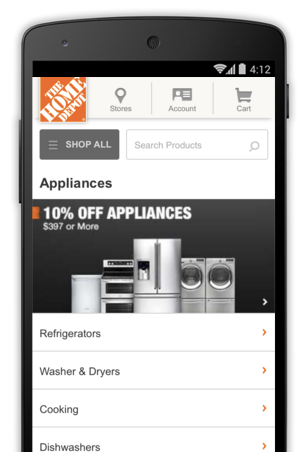
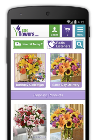
Feature primary calls-to-action in the most prominent site space.

Mobile site design best practices / Homepage

Keep menus short and sweet

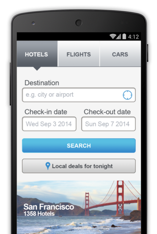
A shorter menu with distinct categories is easier for mobile visitors to navigate.

Mobile site design best practices / Site navigation

Make it easy to get back to the homepage

Use the logo as a navigation button to return to the homepage.

Mobile site design best practices / Site navigation

Don’t let promotions steal the show

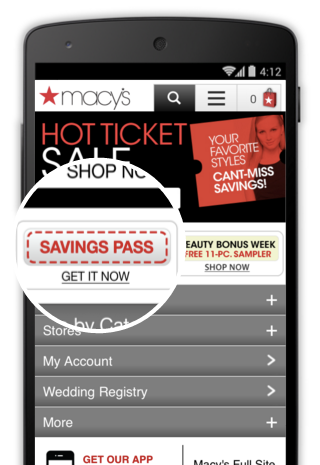
Make sure promotions do not interfere with navigation and are clearly distinct from calls-to-action.

Mobile site design best practices / Homepage

Make site search visible

Position site search near the top of your homepage via an open text field.

Mobile site design best practices / Search

Ensure site search results are relevant

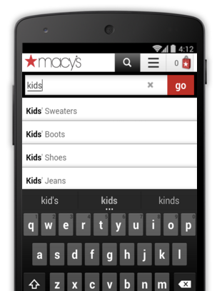
Make sure site search returns the strongest results first, and implement smart-search features like auto-complete and spelling corrections.

Mobile site design best practices / Search

Implement filters to improve site search usability

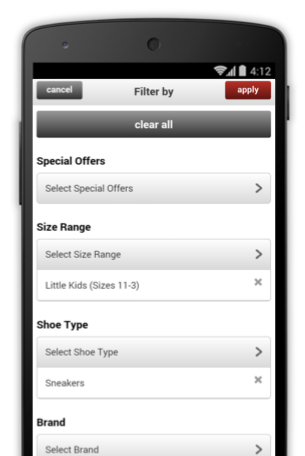
Offer filters to help users get what they need from search, but make sure users can’t filter a search to return zero results.

Mobile site design best practices / Search

Guide users to better site search results

If your offerings can be easily narrowed by segment, asking a few questions up front helps ensure visitors see relevant results.

Mobile site design best practices / Search

UX Principles Commerce and conversions

...

Let users explore before they commit

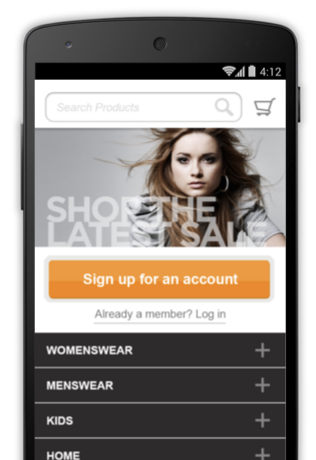
Allow visitors to use your site without registering for an account.

Mobile site design best practices / Commerce and conversions

Let users purchase as a guest

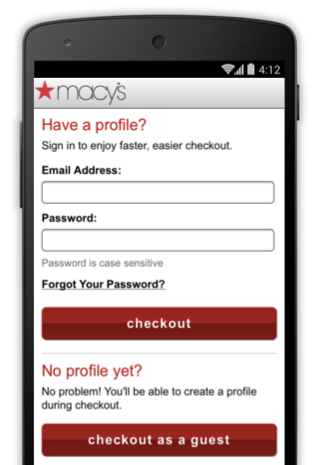
Offer the option to check out as a guest, and encourage registration with tangible benefits.

Mobile site design best practices / Commerce and conversions

Use existing information to maximize convenience

Take advantage of information you already have or use third-party payment services to make conversion as easy as possible..

Mobile site design best practices / Commerce and conversions

Use click-to-call buttons for complex tasks

Offering a prominent click-to-call button can keep users from dropping out of the funnel when they need to provide complex information.

Mobile site design best practices / Commerce and conversions

Make it easy to finish converting on another device

Mobile visitors may be researching to convert later, so offer a simple way to resume their journey on another device via social sharing, email, or save-to-cart functionality.

Mobile site design best practices / Commerce and conversions

UX Principles form entry

...

Streamline information entry

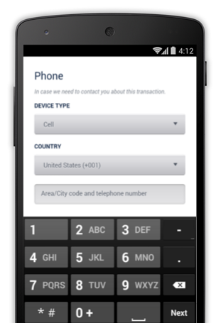
Offer users a number pad for fields requiring number entry, and automatically advance them through form fields as they input information.

Mobile site design best practices / form entry

Choose the simplest input method for each task

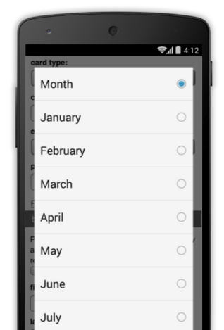
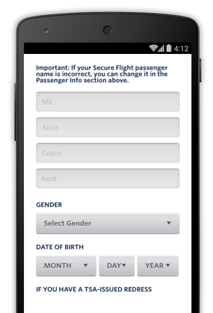
Consider if a toggle or drop-down menu is the optimal choice for each entry on your mobile forms, and always make sure they’re easy for users to tap.

Mobile site design best practices / form entry

Provide a visual calendar when selecting dates

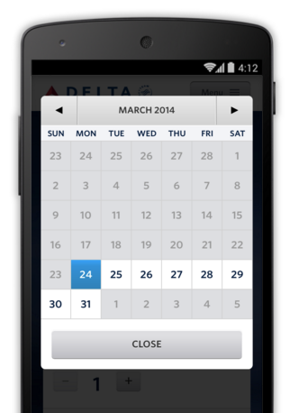
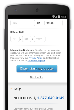
Keep visitors on your site by offering date selection via a visual calendar with clear instructions.

Mobile site design best practices / form entry

Minimize form errors with labeling and real-time validation

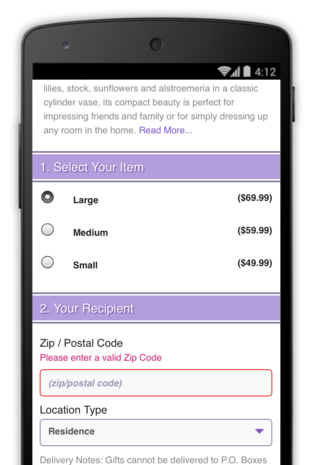
Use clearly visible labels to let users know what you need, and validate for errors in real time to let them know if there’s a problem before they submit a form.

Mobile site design best practices / form entry

Design efficient forms

Minimize the number of fields in your forms, and auto-fill information wherever possible. Use clearly labeled progress bars to help users get through multipart forms.

Mobile site design best practices / form entry

Usability and form factor

...

Optimize your entire site for mobile

Your site is easiest to use if all your pages are designed for mobile.

Mobile site design best practices / Usability and form factor

Don’t make users pinch to zoom

Visitors can miss calls-to-action if they have to zoom in on a site. Design your site so that they never need to.

Mobile site design best practices / Usability and form factor

Make product images expandable

Include high-quality close-ups of key images, like product photos.

Mobile site design best practices / Usability and form factor

Tell users which screen orientation works best

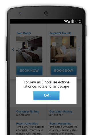
Communicate to users if your site works best in a certain orientation, but ensure your important calls-to-action can be completed regardless of orientation.

Mobile site design best practices / Usability and form factor

Keep your user in a single browser window

Ensure your calls-to-action stay in the same browser window, and add functionality to your site that addresses why consumers might switch windows.

Mobile site design best practices / Usability and form factor

Avoid “full site” labeling

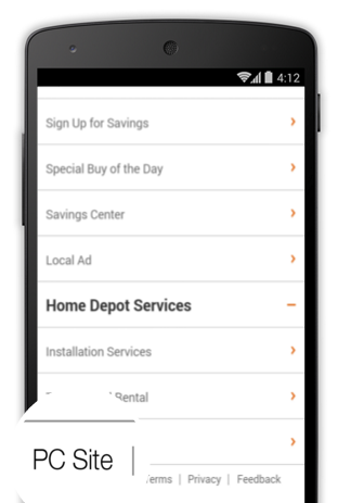
Make it easy to switch between site experiences, but use labels like “desktop” instead of “full” to be clear that both sites offer a full experience.

Mobile site design best practices / Usability and form factor

Be clear why you need a user’s location

Always make it clear why you need a user’s location, and how the information will influence his experience.

Mobile site design best practices / Usability and form factor

Testing and measuring success

A/B TESTING

  1. Google Optimize tools
  2. Optimizely tool
  3. Measuring success with Google Analytics and metrics to focus on
  4. ...

Additional resources

Google exam style guide